Logo design is one of those early business decisions that feels purely creative, but it quietly affects everything: customer trust, repeat purchases, pricing power, and how “real” your business looks at a glance.
This guide is for founders and small teams who are new to branding (especially food, retail, and online-first businesses). It is written to help you choose a logo that works in the real world — on delivery apps, packaging, signboards, social media, invoices, and everything in between.
If you are part of our venture ecosystem, feel free to reuse this as your checklist before approving a final logo.
Why Your Logo Matters More Than You Think
People don’t “study” your logo. They recognise it — or they don’t.
In most buying situations, customers are moving quickly: scrolling Swiggy/Zomato, flicking through Instagram, or deciding whether to trust a new brand. A good brand logo makes the decision easier. It signals consistency and care.
That is why the goal of logo design is not to impress your team. It is to become recognisable to your customers.
What a Logo Is (and What It Isn’t)
A logo is an identifier. A stamp. A repeatable mark that must stay clear across every use.
It is not:
- A full illustration
- A poster design
- A detailed character drawing
- Your entire “brand look”
It is the thing that shows up everywhere:
- Delivery app thumbnail (tiny icon)
- Instagram profile picture
- Packaging sticker
- Invoice header
- Signboard
- Watermark on posters and reels
If it fails in small sizes, it fails where it matters most.
Simple Logos Win Because They Travel Well
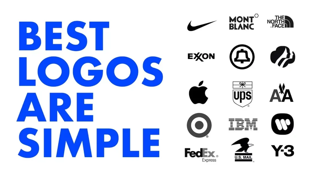
Many new businesses assume “simple” means “boring”. In reality, simple usually means scalable, legible, and memorable.
Look at global examples: Nike, McDonald’s, Mercedes, Apple. These are not complicated drawings — they are clear symbols.
Here’s the practical reason: your logo must look good in two extreme contexts:
- Big: banners, posters, shop boards
- Tiny: mobile app icons, profile pictures, stamps
Designers call this logo scalability. If you want a deeper explanation, this is a good overview:
Kreafolk – scalability in logo design.
The “Pen Test” (a simple rule of thumb)
If someone can roughly draw your logo from memory after seeing it once, you are close to something strong.
If it needs lots of details to look correct, it will be inconsistent across printing, stickers, and social media. Consistency is the real superpower.
Attractive Doesn’t Mean Complex: Use a Two-Layer System
This is where many teams get stuck. Someone designs a beautiful illustrated badge, and the team says: “It feels more attractive than the simple logo.”
That may be true — but you don’t have to choose one or the other.
Best practice is a two-layer system:
- Primary logo: simple symbol (works tiny)
- Supporting artwork: illustrated badge/characters (used for posters, menus, social content)
This approach keeps your core identity clean, while still letting your brand have personality and story.
For example, if you are a momo brand:
- Your logo can be a clean momo icon or wordmark.
- Your illustration can show the founders, spices, steam, culture, and warmth — perfect for marketing.
One becomes the “stamp”. The other becomes the “story”.
Source Files and Ownership: Don’t Skip This
This is where small businesses get hurt later. A logo is not just an image — it is an asset.
Before you approve anything, make sure you have:
- Vector source file (AI / SVG / EPS)
- Font names used in the logo
- Colour codes (HEX, RGB, CMYK)
- Written licence / ownership transfer
Without the original vector file, you will struggle with:
- Signboard printing
- Packaging vendors
- Uniform embroidery
- Future edits and resizing
Rule: if you cannot edit it cleanly later, you do not truly own it.
What About AI Logo Generators?
Tools like AI logo generators and logo makers can be useful for early inspiration. They help teams explore directions quickly.
But for the final logo, be careful. You still need clear rights, and you still need a proper editable vector version. Ownership around AI-generated work can be legally complex depending on how it was created and how the tool’s terms are written.
If you want a sensible overview of the UK position (and why businesses should be cautious), this is a useful explainer:
A&O Shearman – ownership of AI-generated content in the UK.
Practical advice: use AI for ideas, then commission a designer to redraw the final logo as a clean vector, and get written rights assigned to your business.
Brand Guidelines: The Piece That Makes You Look “Established”
Even the best logo will look weak if everything else is inconsistent.
A simple brand guideline (even 2 pages) helps your team stay consistent across every channel. It should include:
- Primary logo and icon version
- Do’s and don’ts (no stretching, no colour changes)
- Colour palette
- Typography (headline + body fonts)
- Photography style (lighting, background, mood)
- Illustration style (if used)
Brand guidelines reduce mistakes, speed up content creation, and make your business look reliable. A simple explanation of why guidelines matter is here:
Creative Shine Marketing – why brand guidelines matter.
Internal link suggestion: If you have (or plan) a venture-wide brand kit page, link to it here:
Brand guidelines and templates.
A Quick Checklist Before You Approve Any Logo
- Small-size test: is it clear as a tiny icon?
- One-colour test: does it work in black and white?
- Print test: does it print cleanly on a 2-inch sticker?
- Memory test: can someone sketch it after seeing it once?
- Ownership test: do you have vector source files + written rights?
If your design fails two or more tests, it may still be valuable — but more as marketing artwork than as the core logo.
Final Thought: A Logo Is Not Decoration
The best logos are not the most detailed. They are the most usable.
A logo is infrastructure. It holds your brand together while your posters, photos, reels, and campaigns change over time.
Keep the logo simple. Build the story around it. Own the files. Use it consistently.
That is how small businesses grow into brands people recognise and trust.
Related reading (internal link suggestions):